Discover Travel Notifications
Discover came to FCB Chicago and asked for a new, revamped look for cardmembers to set Travel Notifications on their credit cards. I worked with the UX team to create a responsive web experience, complete with a new grid, typeface and visual elements. Live experience is currently in development.
Role: Product and Visual Design, Journey Map Creation

The current Travel Notifications experience isn't surfaced within the Global Navigation, just one of the many UX challenges. The white page with black and orange text is not up to our new design standards that FCB is rolling out.

At the start of the project, I worked with the UX team to create a journey map of an average Jane planning her international trip (we saw more planning points for international v. domestic.) The Planning phase starts with the idea, actually buying your tickets, and then the "waiting period" before the trip itself.
We saw that travels are pretty overwhelmed during the "Create a Plan" and "Let's Get Ready" phases. This was our main insight to begin wireframing our simipliest solution for cardmembers to alert Discover they are traveling.

In mid-2016, our creative team worked together to create a new grid system going forward. We set minimum and maximum breakpoints, allowing for the most fluid experience for browser resizing.

A major update to Travel Notifications was applying our new typeface and iconography. Currently, these adjustments are on a per-project basis and will soon be global elements.

The new landing page features a hero marquee and a new table layout for the entire experience. On desktop, the experience breaks into two columns, showcasing a new data feature for "Upcoming Trips." On tablet and mobile, the experience hits max width of their respected grids, stacking each table on top of each other. Icons are also suppressed on mobile to bring content higher in view.

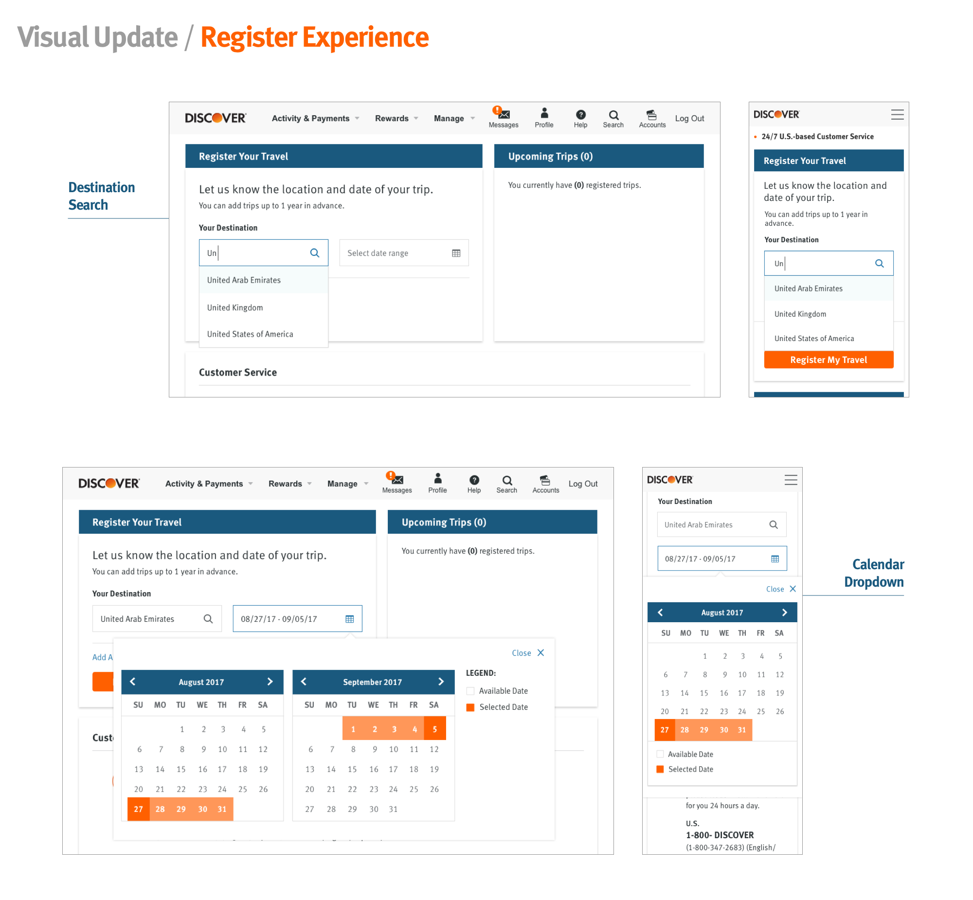
A cardmember begins the registration flow by searching their destination (country only,) featuring an auto-complete text field. Next, they'd select the date range for this specific country. If they are traveling to a different country, clicking "Add Another Destination" will allow them to set that.

After successfully registering, the cardmember is shown that their trip has been added to the "Upcoming Trips" table. In this table, they can see what Discover family logos are accepted and their acceptance rank (High, Medium or Low.)

Lastly, but certainly, a main priority, was making sure Customer Service and FAQ's were displayed throughout the entire experience. Adding in new iconography helped simplify the ways to contact Discover, whereas the clean expand/collapse FAQ drawers saved real estate.

