


Discover came to FCB Chicago to overhaul their Miles Redemption experience. Working with the UX department, I helped to lead this project to launch after a creative hiatus. Visual updates included marquee guides, dynamic data tables and transaction flows.
Role: Product and Visual Design
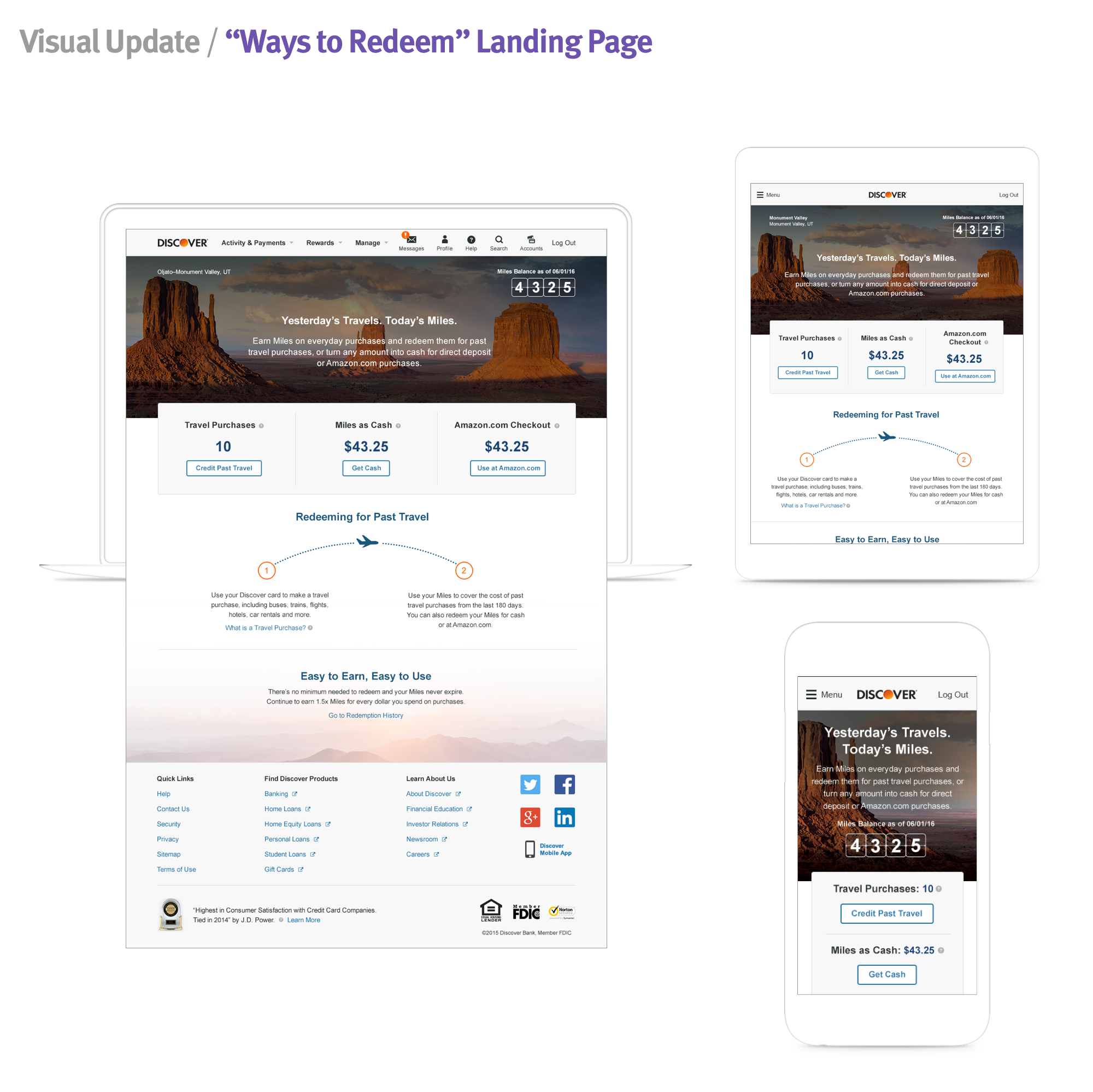
The imagery was a high priority for the creative team, and I worked with my Creative Director to set the guidelines. Landing pages displayed the taller marquee, whereas interior flows had the smaller one. The photography rotated to showcase US cities landscapes to apease the traveler's mindset.
From the Global Navigation, cardmembers would land onto the "Ways to Redeem" page as their home base. Here, they'd see their current number of Miles, and entry points (Travel Credit, Electronic Deposit and, Amazon.com) to redeem them. Tooltips were added after user testing next to each entryway, giving them further assurance on how to redeem.
If a cardmember wanted to redeem Miles and have their next statement credited, they'd chose "Travel Credit." In the old experience, most cardmembers would redeem all of the Miles, which is why we put that as the primary action. If they want to select specific purchases, the table is laid out below.
After selecting a purchase, the cardmember has the option to adjust the number of Miles to redeem. Once they submit, a confirmation page is loaded to celebrate their redemption. Photography, again, is rotated to showcase a breath of travel.
If a cardmember wants to redeem their Miles for cash, the "Electronic Deposit" is the way to go. After several rounds with legal, the experience used to be titled "Direct Deposit," but user testing showed that "electronic" got the point across faster.
The old Miles experience did not have an Amazon.com partnership, so this landing page had to be simple and clear that you'd be leaving Discover.com and going to Amazon.
Once a cardmember has successfully redeemed their Miles, they can check out their Redemption History. Transaction drawers are defaulted to be closed for easy scanning.